Thursday, November 6, 2014

Still life Photograph Assignment

The art assignment this week was to choose an everyday object and use it in a still life in an unexpected way.  You were to photograph the still life and send it to me via email or text.  We weren't able to talk about your images last class so below are the photographs I received.  

When you look at these, think about which ones are the best solution to the problem.  How are your classmates using the objects in an unexpected way?  Which photographs hold your attention and why?  


Saturday, September 13, 2014

Abstraction in Art

Have you ever seen works of art like the one below and heard or thought, "What's so great about this painting?  I could do that!!" 


The answer to that question is, yes, you could do that.  However, these artists were trying something new for their time and is called abstract expressionism.  Their paintings did not try to show objects from real life.  Instead, they used lines, shapes and colors to represent ideas, emotions, sounds, etc in their work.  Their emphasis on lines, shapes and colors makes their work abstract.

The word abstract also has another meaning in art.  Abstract can refer to simplifying real life scenes or objects into lines, shapes, and colors.

Here is an example of what I mean:

This is a photograph of the New York Stock Exchange


There are many details in the photo and the emphasis of the photo is the building, the flag, and the statue in the foreground.  

However, when I ran the photo through a filter, I changed the image to this:


It is still the same photograph but many of the details were eliminated.  It is still a photo of the New York Stock Exchange but now it is also about the shapes and lines in the image.  It is more simple.  It is abstracted.

Here is another example.  
This is a photo of a large Buddha in Thailand.  You are looking up at the statue from the ground.  The photograph isn't so much about the statue (otherwise it would have been taken from the front so you can clearly see the Buddha) but more about the shapes and lines made by the statue at this angle.


Here is one more example.  

The photo below is an image of a knot tied in a yellow scarf on another statue in Thailand.  


I zoomed in and chose a section of the knot that had interesting positive and negative shapes.


Then I ran it through a filter that simplified it again and really just turned it into shapes.


Now the photograph is about shapes, colors, and lines but not about a knot in a piece of cloth.

Get it?

Here is a summary:  

In art, the word abstract can refer to a movement of art (such as abstract expressionism) that only used lines, shapes, and colors to often represent ideas, emotions, sounds, etc.

The word abstract can also refer to taking a real object or scene and simplifying it so that it becomes lines, shapes and colors.

If you are confused, don't be dismayed.  We will be working on abstracting an object in a drawing during our next class.  Be ready.  This is gonna be fun!


Wednesday, September 3, 2014

Contour Lines in Art

A contour line in art is wherever you find an edge in an object.  Generally, it can refer to the outside edges of objects.   Hold out your hand.  Do you see the outside edge of your hand and how it separates your hand from the background around it?  This is a contour line.


Contour lines are also the edges of shapes in an object.  Do you see how this shoe is actually made up of little shapes?  There are contour lines around each shape.


If you can find the lines and shapes that make up objects you can draw anything.  


Monday, August 25, 2014

Zentangle Patterns

During last class, we began working on filling the negative (or empty) space in our letter drawing with zentangle patterns.  Below is a photo of some additional zentangle patterns you could use.  You can also explore other patterns by doing a search on the internet.  

Sunday, February 16, 2014

Jamming at the Savoy by Romare Bearden

Look at the image of the Romare Bearden collage below.  What do you think is happening in the image?  What types of colors do you see?  What is the mood of the collage?


Wednesday, January 29, 2014

Monochromatic Colors

What are Monochromatic Colors? 

First we have to do a little vocabulary...

Name as many different kinds of blues that you can.
Baby blue
Bright blue
Royal blue
light blue
teal
sapphire blue
etc....

These are all different kinds of "blue".  Blue is actually a BIG category with many different kinds of colors inside it.   Therefore "blue" is actually the name of a hue.  A hue is a big category of colors.  A color, such as baby blue, fits into the hue of blue.

Make sense?  I hope so.  

A monochromatic color scheme uses only one hue but many different colors of that hue.

For example, look at the painting The Old Guitarist by Pablo Picasso.


He essentially uses only one hue (blue) many many different kinds of blue. Yes, there is a little orange but work with me here...

Remember tints (a color plus white) and shades (a color plus black)?  Many times monochromatic color schemes will use tints and shades to make new colors of a hue.  Where do you see tints and shades in The Old Guitarist?


Color Schemes

We've explored the color wheel in class and how it is a way of organizing colors. 


You can use the color wheel to help you remember how to mix colors but what other ways can you use the color wheel?

You can also use the color wheel to put colors together in groups called color schemes.  

Remember complementary colors?  These are colors found across from one another on the color wheel.


Blue-Violet and Yellow-orange are complementary colors.  Complementary colors often aren't "matching" colors.  They fight for attention when placed next to one another and make each other look brighter and more colorful.  You can also mix complementary colors to make neutrals or different types of browns.

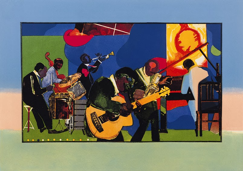
We can also take the color wheel and divide it into warm and cool colors.  Where do you think are the warm colors on this color wheel?  Where do you think are the cool colors?


Warm colors remind us of warm things such as fire, lightbulbs, or hot stoves and include red, red-orange, orange, yellow-orange and yellow.  Red-violet and yellow-green sometimes can be considered warm but sometimes they are cool colors too.

Warm colors tend to pop out at us and make objects look like they are in the front of the picture.

Where do you see warm colors in the Van Gogh painting below?  Why did Van Gogh use the warm colors there and not in the background?  


Cool colors remind us of cool things like ice, water, or shade and include blue, blue-green, violet, blue-violet and sometimes red-violet or yellow-green.  

Cool colors tend to give a feeling of calmness to a work of art.  Cool colors also tend to make objects or areas recede or go back to the background in a painting.

Why did Van Gogh use cool colors in the background in the painting above?  Where is your eye go to first in the painting and want to stay?  What if he had used only warm colors in the background too?  How would this have changed the painting?

Read the next post about monochromatic colors!!!